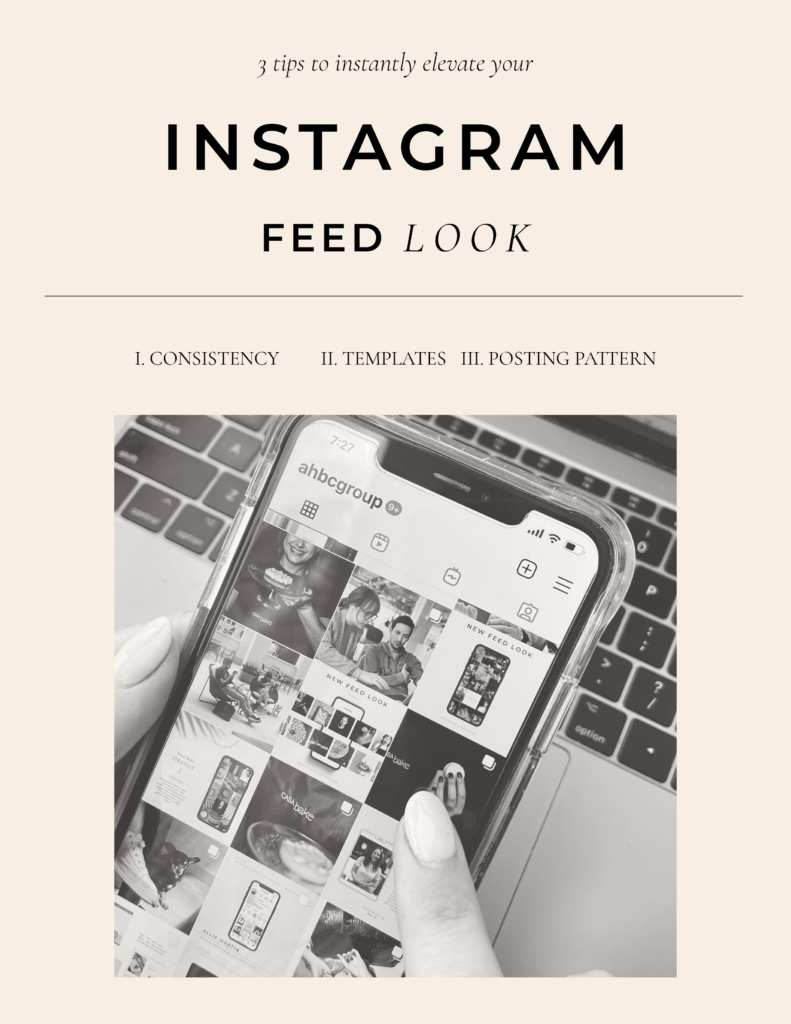
3 Tips to Instantly Elevate your Instagram Feed Look
Let’s discuss Instagram #aesthetics. If you are active on the most visually appealing social media that is Instagram, you have probably noticed how some accounts seem to have it all perfectly together, and maybe even caught yourself dreaming about making your own account just as drool-worthy.
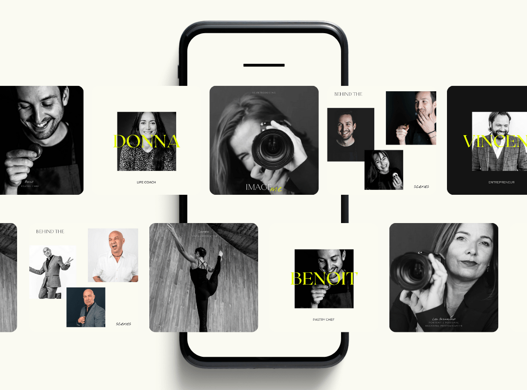
Want to elevate your feed look fast and easily? Here are 3 tips I picked up, through crafting clients’ feeds that ensure a super cohesive and aesthetic feed for a polished look.
#1.
BE CONSISTENT TO ACHIEVE A VISUALLY COHESIVE FEED
As you have probably noticed, the best-looking feeds look extremely cohesive. You can instantly tell which account that post is from ( #brandinggoals) and the profile looks put together, no post seems to look different or out of place on the grid. You can achieve that same visually cohesive feed by implementing these 2 things:
USE THE SAME FILTER/EDITING COMBINATION ON ALL PICS
You want to make sure all photos look similar. We take them in different places that have different lights and colors. This is fine but you want to correct the differences with editing so it all looks cohesive in the end. You can purchase a preset, manually edit yourself or figure out a filter or combination that fits most types of pics you post and always use the same. A super easy combination that I love is simply the “auto” filter from the iPhone, to which I then add the “dramatic” filter.
You also want to do the same on Stories, because branding doesn’t stop at the feed. You can use the same combination, or if you don’t want to get out of the app, pick one of the stories filters to use consistently. I like Paris and Montreal for a lighter look (they also make your skin look great) and Los Angeles or Jakarta for a darker vibe.
DEFINE AN INSTAGRAM BRANDING WITH A COLOR PALETTE & TYPE SUITE
You may not have a full brand visual identity (yet). That doesn’t mean you should be all over the place. Define a color palette and type suite that you always use for graphics (and stories).
For color palettes, I love using coolors. Use the random color generator until you find a combination you like or select the shades you have in mind for your brand. If you are not used to designing, less is more: pick up to 3 colors (2 is fine) + black and white.
For your type suite, the same rule applies: 2 to 3 fonts maximum. Pick one for titles (or titles & subtitles) & one for body (paragraphs). You can select free fonts from Google fonts or directly from Canva.
#2
CREATE TEMPLATES FOR DIFFERENT TYPES OF POSTS
FEED POSTS
Now let’s talk graphics! First of all, you want to figure out which types of posts you will be constantly creating. Here are a few common ones: quotes, testimonials, brand features, event announcements, new blog article or podcast episode, celebrations (holidays and company milestones). Then open your favorite design software, usually InDesign if you are a designer or Canva. In Canva work from templates you like or create your design from scratch. Templates are great to help guide you, but make sure you tweak them and really make them your own, for a unique look and feel. Switch the fonts and colors to the ones you defined for your Instagram visual identity. You can also play with different elements, such as drawings or frames.
HIGHLIGHT COVERS
While you’re at it, design highlight covers as well. They appear at the top of your profile (between the bio and the feed grid) and are one of the first things your followers see when visiting your profile. You can use icons (find them in “elements” on Canva), text (write the title of the highlight in the Title font you chose) or simply a color (gradient from one or several of the colors from your palette).
HOW TO HANDLE STORIES?
For stories, you can either create templates as well – Canva allows you to automatically resize with the pro plan. If you are with the free version, simply create a blank story format file and copy-paste your feed designs there (you may need to reselect the background image or color when you do that). And voilà!
Option number 2, for a more authentic look and/or as a combination, pick 1 filter from Insta Stories to use consistently and 1 font from the options offered on stories, with 1-2 colors from there as well.
#3
FOLLOW A CLEAR POSTING PATTERN
Now that you have your visual identity defined, templates designed and pics edited, time to post! Whether you use a scheduling tool such as my personal favorite, [Later](http://later.com), or post from your phone, you can ensure a cohesive feed by following a “pattern”. This means posting the same type of content at the same interval to create a balanced look. Here are some suggestions:
- 1 pic – 1 graphic
- 4 pics – 1 graphic
- If you do not use graphics, the same patterns can be applied with colors and tones. For instance 1 photo is light – 1 is dark.
CONSISTENCY > AESTHETICS
It takes 12-16 posts to create a full feed, so you should see results soon after implementing those tips. Although a cute feed is great, remember that consistency is far more important than aesthetics. Meaning crafting the perfect-looking feed should not prevent you from posting consistently. These tips are meant to help you improve but certainly not block your creativity or spontaneous posting if that’s what you like.
A pretty IG feed is cool but a real, authentic, and consistent one is better!
Come say hi! on Insta and I’ll check out your profile 😉
You can also follow us on Facebook, Twitter and LinkedIn for more social media tips! If you leave a comment we’ll answer it (pinky promise). And if you need help with making your feed look amazing, we’re here!
